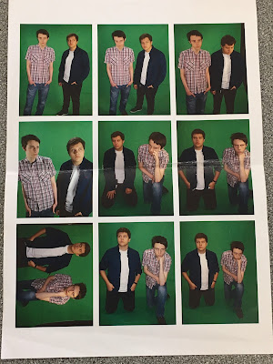
In this post, I am showing the contact sheets that I made for the images I took when preparing to make my music magazine. To make these, I had the images separated into three groups; Indie pictures (which I never used for my magazine), Rock pictures and the picture I had took in Town. Afterwards, I highlighted all images in their individual group and chose to print therm. When I pressed print, the images below showed up. I changed the paper size to A4 and chose to print the images as a contact sheet (aside from the Indie group where I printed them as Wallet, since there wasn't enough pictures).
Below are pictures of the contact sheets after they have been printed. However the first two contain pictures that I din't use for my music magazine as they were taken for another person's magazine in the Indie genre which wouldn't have fitted with the Rock genre I was going with.
The other two contact sheets contain the photos that I used for my music magazine. They are both annotated when I was trying to decide which ones to use. The second contact sheet I used for creating a layout for my double-page spread to give me a frame of reference to see how many columns it should have. I ended up using the first one below to take the most pictures for my magazine with only one of the pictures on the second sheet being used.


OK well done David.
ReplyDeleteNow can you explain why you have created these contact sheets please.
Remember discuss good lighting, poses, location shots, green screen shots etc
Mrs McD-H
you have held a target audience interview which I know has influenced your final design and its development... make sure that youi have addiong the changes you made and that this was in response to the responses your TA voiced
ReplyDeletethat was a nice post. Thanks
ReplyDelete