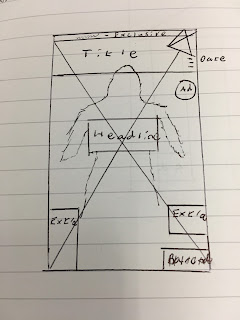
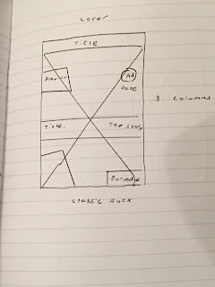
In this task, I have to create my own music magazine. To do this I have to choose a genre of music, look for a front cover, a contents page and a double-page spread.
I decided to choose the rock genre as it has a wide variety of music within it and it has a very tense atmosphere towards it as well as it being a genre that I enjoy listening to. When that was done I went on the Internet and found some music magazines.
 |
| This contents page is from the magazine "Kerrang!". I decided to choose this as it had an eye-catching layout to it. |
 |
| This is the double-page spread that I found online. I decided to pick this because I thought that the design of having the picture in the background of the text an interesting idea. |


For all three thumbnails I attempted to have them be as close to the original magazine pictures as possible but there is the possibility that the actual magazine designs will end up looking slightly different to these.
These next three thumbnails are ones that I took from other music magazines as alternatives if the others didn't turn out so well. But they would eventually not be used for the magazine.


Hi David, can you extend your introduction a little more please. What websites did you use to gather information?
ReplyDeleteTell me why you chose these pages, covers and what inspired you to use the Rock genre?
With your thumbnails discuss your methods please, where do they fit in? Are they a re straight copy of the web found ones? If so discuss please.
200-300 words per post please.
Mrs McD-H
good post
ReplyDeleteberdikary