Friday 25 November 2016

Contact Sheets

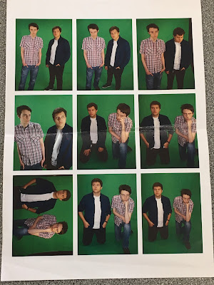
In this post, I am showing the contact sheets that I made for the images I took when preparing to make my music magazine. To make these, I had the images separated into three groups; Indie pictures (which I never used for my magazine), Rock pictures and the picture I had took in Town. Afterwards, I highlighted all images in their individual group and chose to print therm. When I pressed print, the images below showed up. I changed the paper size to A4 and chose to print the images as a contact sheet (aside from the Indie group where I printed them as Wallet, since there wasn't enough pictures).


Below are pictures of the contact sheets after they have been printed. However the first two contain pictures that I din't use for my music magazine as they were taken for another person's magazine in the Indie genre which wouldn't have fitted with the Rock genre I was going with.


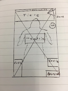
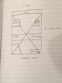
The other two contact sheets contain the photos that I used for my music magazine. They are both annotated when I was trying to decide which ones to use. The second contact sheet I used for creating a layout for my double-page spread to give me a frame of reference to see how many columns it should have. I ended up using the first one below to take the most pictures for my magazine with only one of the pictures on the second sheet being used.


Tuesday 22 November 2016

Feminism

In theory, feminism is trying to achieve better rights (whether they be social, cultural, economic) for women. This is linked with attempting to gain equal rights with men. This is a good thing as inequality between the two genders has went on for far too long and feminism is a way to reverse this.

This type of feminism can be divided into three different waves:

First wave feminism took place from the mid-19th century (mid 1800s) to early 20th century (1900s). This was women trying to fight for equal social and political rights, with the main focus being on getting the right to vote (suffrage). This succeeded in getting women the vote (1918; women over 30 could now vote. 1928; women and men vote on equal terms). Other results included; women being allowed higher education, property rights and jobs being more available to them.

Second wave feminism was a libertarian movement during the 1960s and 1970s. This mainly focused on issues like unequal pay, rights at work and not having enough representation in public bodies such as Parliament.

Third wave feminism occurred in the 1980s and 1990s and was different compared to the two previous waves in that it was less about fighting for equality (which has, more or less, been achieved) and more about emphasising positive qualities about women.

All of these waves were positive and all-around successful however recently there has been a, most-likely, vocal minority in the feminist group. These feminists could be said to have painted a bad image for the movement as, nowadays, when people talk about feminism they usually mean it in the negative sense that these feminists use.


This is an example of a bad feminist stereotype by Pat Robertson. This is obviously not true but some people have taken it to heart and do believe this about feminists. The reason for this may be because of the actions of the small minority of feminists as mentioned above. It should be noted that as of 2016, Pat Robertson is 86 years old so his viewpoints are from a radically different time were gender inequality was much more prevalent in society.

Semiotics

Semiotics are about the meaning in media text, its studying how the producer attempts to get that message across (signs and signifiers act as clues). The implied meaning in the media text is called the denotation, the way the viewer reads the meanings is called the connotations. These are not always the same as what has been denoted due to misunderstanding, cultural/age/gender differences and our own experiences. Our thought processes in trying to understand the denotations need to recognise the symbols, metaphors, analogies and allegories.
A paradigm is a set of rules that we check the meaning against to make sure that it makes sense. Example: A panda eats, shoots and leaves. You can get as drunk on water as you can on wine.
A syntagm is a key piece of information that if changed will change our connotations.


Definitions:

Analogy; Comparing two things to each other either for explaining or clarifying.

Allegory; A work (story, poem etc) that can be interpreted by the reader to have a hidden meaning even if there wasn't one intentionally. This can also be a synonym for a symbol.

Metonymy; This is when substitute the actual name of something to an attribute of what is being described. An example being referring to a business executive as a 'suit'.

Monday 21 November 2016

Main Task-Front Cover Version 1

In this task, I had to create my own music magazine (more specifically, just the front cover, contents and double-page spread) based on actual magazines we found. The inspirations for my magazine are shown in an earlier post.

Front Cover:
This is a layout for my music magazine's front cover that I created in InDesign. I think it has a simple enough layout that I could do some interesting things with. All text boxes are labelled with what I am planning to put inside them.
This is an early version of my music magazine's front cover. I put in one of my photos that I edited in Photoshop using threshold and invert to gain the effect. I picked the title because I felt it was something that would draw a reader in. I then chose the name for the rock band on the front cover.


These are multiple versions of my music magazine's title in different fonts. I decided that these five were the best ones but went with the first because I found it to be bold and striking but still subtle though the fourth one was effective in meeting this criteria also. While there were several other fonts that I liked, I decided against them for the same reason I eventually changed the headline on the cover; because I found them more difficult to read.

Friday 18 November 2016

Main Task- Town Photos

During the weekend, two members of my media studies class and myself went into town to take photos for our music magazines. We went around town to a variety of different locations for the pictures. We wore clothes that would feel appropriate for any of our magazines. All the pictures shown here are shown as they were originally taken. No edits.


Firstly, we took some photos of each one of us in front of a brick wall. These were taken so we could use are faces if we needed an introduction on our magazines.


This is a picture we took by the dock where the person in the picture is staring out at the sea. It is shot from an angle where we focus on him and not what he's seeing.


This is a picture taken at the docks where the two are staring out at sea with their backs faced toward the camera. We are able to see what they are. 

Here, he is staring at the ship. The camera allows us to see a part of his face along with what he is staring at. The lighting on his face creates a nice atmosphere.

This is a picture is similar to one above.


These next few pictures have us sitting on a bench staring out at the river. Our backs are turned so our faces are not seen so that means our body language communicates us to the audience. These pictures generally don't have much to them but they were taken just because the three of us felt they looked unique and interesting.


This was taken because I found the position and atmosphere at the time good enough to take a unique picture.


The final images are ones we took in front of a building that had pictures of town on it. We all took turns being behind the camera and tried out a variety of poses for the magazines we were doing. For my magazine, I decided to use the first and last ones in the images below. The reason why we took multiple pictures in front of this background was because the pictures on the wall gave a good look for the pictures once taken and is more visually interesting then just a blank background.


Tuesday 15 November 2016

Main Task-Green screen Pictures

During this task, I had to take some photographs in front of a green screen to be used in my music magazine. For these pictures, a member of my class and myself posed for these photos.

The first thing that I decided to do was to take some photos with just one of us in.

Once this was complete, we took some pictures of us together.

Because I decided to use rock as the genre of my music magazine, I thought that we should have a mean or apathetic look to us as I felt it fit the genre's codes and conventions.
 This picture on the left I feel was particularly good as the lighting on the face created a dark atmosphere.


This picture on the left is one where the lighting is reflected on our faces which I believe gives it a good feeling towards it.

When taking all these pictures I learnt how difficult it is to work in front of a green screen as you have to make sure you don't cast a shadow on the green screen because it would make it difficult to put in a background. I also learnt how using the light could create a more effective and eye-catching atmosphere.

Questionnaire

In this task, I had to create a questionnaire about music magazines. The first thing I did was find three different covers from different genres of music. I used this as a basis so the person taking the questionnaire knew what the questions were talking about.

Below are the two pages of my questionnaire. When creating the questions I tried to have ones that would allow for greater variety in the answers which resulted in a lot of open questions. I used as many closed questions as possible (giving several options) so that I could later create pie charts to show results.


After I had made the questionnaire, I had ten copies printed off and gave them to my friends and family to fill in. Once they had been filled in, I had to create a few pie charts to show the differences in the answers. The problem I now faced was that the questions were pretty open-ended so I ended up creating three pie charts based on; age, which cover they liked most and what their favourite genre of music is.
This is the pie chart that shows the age range of the people who answered the questionnaire. Based on the results, the 10-15's, 16-20's and 71+'s had the highest number with all three having two people answering the questions. The reason why I went with these people was to have a large variety of people's age in the audience so that there would be less bias as 3 age groups were even in number.

This is the pie chart based on the cover preference that people gave in the questionnaire. Out of all of them, the second cover is the most liked with over half of the people who took it believing it to be the best. 

This is the pie chart that I made that represents the responses I got when the questionnaire asked what their favourite genre of music is. All the options on the left were the only answers that were received. Rock turned out to be the most popular out of them.
This is an example of a completed questionnaire.

What I found out in this completed questionnaire was what a person between the ages of 41 and 50 would like about these magazines. They apparently liked the third magazine because of its colouring which "grabs my attention".

Wednesday 2 November 2016

Main Task Planning

In this task, I have to create my own music magazine. To do this I have to choose a genre of music, look for a front cover, a contents page and a double-page spread.

I decided to choose the rock genre as it has a wide variety of music within it and it has a very tense atmosphere towards it as well as it being a genre that I enjoy listening to. When that was done I went on the Internet and found some music magazines.
This is the cover from a rock magazine called "Classic Rock". The reason why I chose this was because I felt it was had a simple and effective layout that could be slightly altered to fit my magazine more.

This contents page is from the magazine "Kerrang!". I decided to choose this as it had an eye-catching layout to it.
This is the double-page spread that I found online. I decided to pick this because I thought that the design of having the picture in the background of the text an interesting idea.


For all three thumbnails I attempted to have them be as close to the original magazine pictures as possible but there is the possibility that the actual magazine designs will end up looking slightly different to these.

These next three thumbnails are ones that I took from other music magazines as alternatives if the others didn't turn out so well. But they would eventually not be used for the magazine.