Tuesday 18 October 2016

(September) Prelim Task: Photoshop Practice; Mastheads


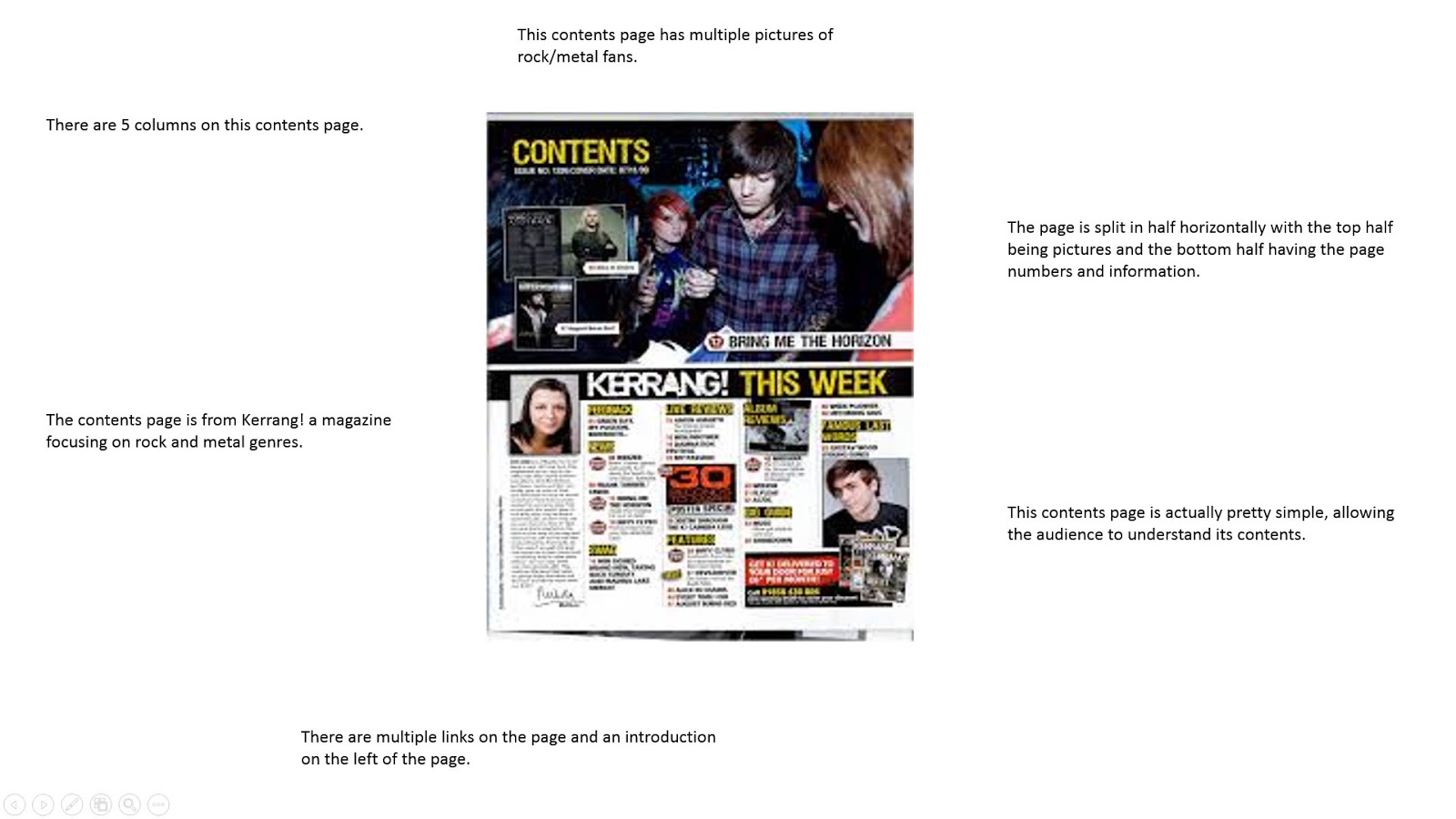
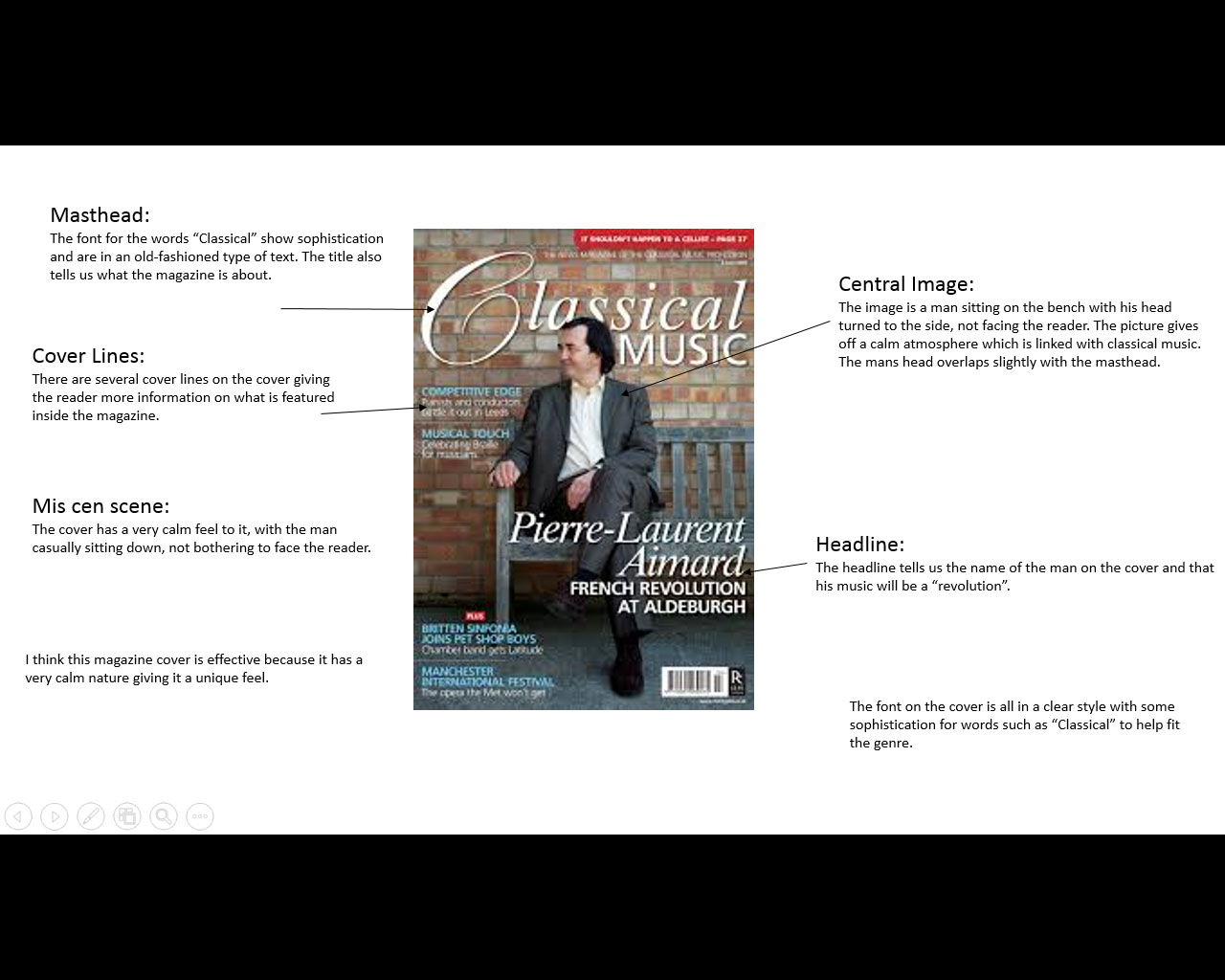
In this task, I learned how to use Photoshop to create unique mastheads for a college magazine.


First, I used the title "Heenan News Weekly". I changed the font to make it stand out more and put the weekly beneath the other two words. I coloured them to make them more eye-catching.


Next, I used changed the colour of the "Weekly" so the shadow of it was black. This was done to make it more unique.


Then, I shrunk down he "Weekly" and put it beneath the the "News" part of the title.


Finally, I flipped it vertically and, after putting the "Heenan News" to the left, I put the "Weekly" with the rest of the title.


We started again with a new masthead. Here we learnt how to put images into our words shown below with "Cardinal". (Note: For some reason, my computer had made all the colours on Photoshop black, white and grey)


Once this was done, I was told by the teacher to start over with a new design.

Next, I edited the title to embolden it allowing it to stand out more. I also changed the colour of the background to experiment (though it appeared grey).


Afterwards, I created a shadow for the title making it more eye-catching.


I backtracked, taking away everything from the title, and put a new image in each letter of "Cardinal".


This was the final result of another attempt at using Photoshop. Here I used one of the tools to put multiple little "News"'s inside the "Cardinal" part of the title.


This task really assisted me in understanding how to use Photoshop as I learnt how to edit in pictures and manipulate the size of the text. Before this task I would rate my skills with Photoshop as 2/10, now I'd put it as 6/10.

Friday 14 October 2016

Music Magazines Analysis

In this task, I was asked to choose a couple front covers, contents pages and double-page spreads from music magazines. I then had to analyse their layout and see if they meet the standard codes and conventions for their genre.
This is a rock magazine cover from a magazine called "Kerrang!". I chose this because it stands out to the reader. I believe that this magazine works due to its ability to draw in the reader with the looks of the men on the cover. It has a type of atmosphere where you can't help but be drawn into.
This is a magazine called "Classical Music" obviously about classical music. I chose it for its calm atmosphere. This works as the calm nature is perfectly suited with the classical genre.

This is "Country Weekly". The genre it focuses on is country and I chose it for its inviting nature. It works because it has an upbeat and friendly atmosphere about it along with being calm.

This is a contents page from a rock magazine. It is laid out in a seemingly convoluted but actually simple and easy to read which is why I see this as a good choice for a contents page.

This is the contents page from a classical music magazine. I chose this for its unique red background which I believe helps it stand out in comparison to other contents pages. Unfortunately, the text was in another language meaning I couldn't analyse much about the text.

This is a double-page spread from a rock music magazine. I chose it due to it being an interesting example as one page is just as picture and the opposite page is all text with just a bit of an overlap.

This is a double-page spread from a classical music magazine. I chose this because it evokes a calm feeling from it, fitting for the genre, and it is a perfect contrast to the previous double-page spread as it balances the picture and text more effectively.


Friday 7 October 2016

Prelim Task-Magazine

So far in Media Studies I have been researching different formats of college magazines in order to make my own in Adobe InDesign and Photoshop. I first had to use a magazine of my choice to draw out thumbnails of a front cover, contents page and a double page spread. I used these to create the actual pages in InDesign, using Photoshop to edit the pictures to make them look better.
The front cover of the magazine. Here I used other pictures aside from the central image as I found the central image, on its own, as too boring. The reason I chose the central image was because I felt it used Mis En Scene well as the direct mode of address meant it had an inviting impression towards the reader. I had a simple headline and masthead to meet the typical codes and conventions.
The contents page of the magazine. I changed the font colour of the text to make it stand out more against the white background.
The double-page spread. (There was a mistake in the transfer of the photo causing the text in the fourth column to overlap with the photo)


The magazine that I based my college magazine on.
The contents page that I used for my magazine.
The double-page spread I used as inspiration for my magazine.

The thumbnail that the college magazine I made was based on.


An example of Photoshop where I changed the background to black.

My media studies classroom.

Me working on the magazine.

My class drawing thumbnails before we started making our magazines.

Justification for my choices:
The reason why I chose the magazine 'SFX' as the basis for my college magazine was because they had good layouts. However by the end of the task, they had all been changed to fit my magazine to the point that they barely resembled what I had based them off. The reason I had changed them was a combination of me not being proficient enough in Photoshop, not having enough pictures to use and the original designs may not have worked well for a college magazine.