So far in Media Studies I have been researching different formats of college magazines in order to make my own in Adobe InDesign and Photoshop. I first had to use a magazine of my choice to draw out thumbnails of a front cover, contents page and a double page spread. I used these to create the actual pages in InDesign, using Photoshop to edit the pictures to make them look better.
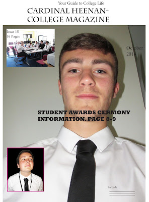 |
| The front cover of the magazine. Here I used other pictures aside from the central image as I found the central image, on its own, as too boring. The reason I chose the central image was because I felt it used Mis En Scene well as the direct mode of address meant it had an inviting impression towards the reader. I had a simple headline and masthead to meet the typical codes and conventions. |
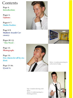 |
| The contents page of the magazine. I changed the font colour of the text to make it stand out more against the white background. |
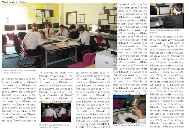 |
The double-page spread. (There was a mistake in the transfer of the photo causing the text in the fourth column to overlap with the photo)
|
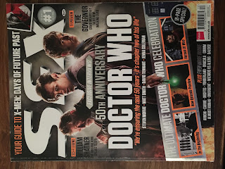 |
| The magazine that I based my college magazine on. |
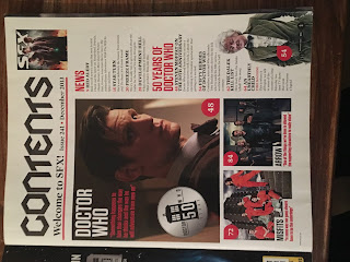 |
| The contents page that I used for my magazine. |
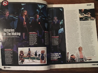 |
| The double-page spread I used as inspiration for my magazine. |
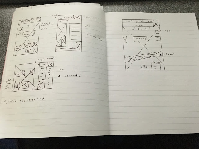 |
| The thumbnail that the college magazine I made was based on. |
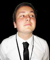 |
| An example of Photoshop where I changed the background to black. |
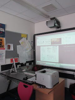 |
| My media studies classroom. |
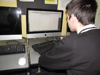 |
| Me working on the magazine. |
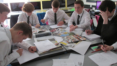 |
| My class drawing thumbnails before we started making our magazines. |
Justification for my choices:
The reason why I chose the magazine 'SFX' as the basis for my college magazine was because they had good layouts. However by the end of the task, they had all been changed to fit my magazine to the point that they barely resembled what I had based them off. The reason I had changed them was a combination of me not being proficient enough in Photoshop, not having enough pictures to use and the original designs may not have worked well for a college magazine.


A lot more comments needed please David.
ReplyDeleteYou created lots of great work so show us please and discus methods, programs used etc.
More screen shots please, showing your process.
To be uploaded before lesson tomorrow.
Mrs McD-H
how did the adjustments on the photographs make them better?
ReplyDeletefar more annotation needed - what was successful? what did you know before? what did you learn in this process?
ReplyDelete